

Guest post by John Hunter, author of Management Matters: Building Enterprise Capability.
Data can provide insight or be used to mislead. When looking at data, you need to critically think about how you could be misled.
One of the things you learn as a scientist is the ability to look at a plot and think, “that just doesn’t look right.”
Quote by Andrew Dessler in his exploration of using data to mislead. Here is an image chosen to make it seem like “heat waves” were more common in the 1930s than recently.
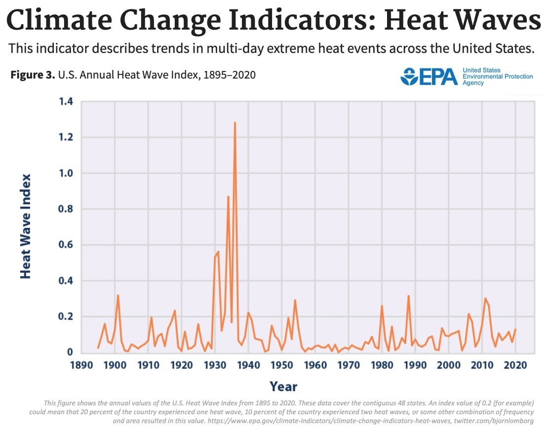
Here we find that the “heat wave index” counts the occurrence of 4-day heatwaves of temperatures exceeding a 1-in-10 year recurrence.
There’s nothing intrinsically wrong with this definition, but it sure seems arbitrary. Why 4 days? Why 1-in-10 events?
When doing science, you should always be worried that arbitrary decisions (e.g., thresholds in an index) will give you arbitrary results.
So the question is: if you change your definition of “heat wave”, would you get a different answer?
No one will be surprised that, indeed, you do find huge increases in hot days and heat waves recently if you use most any other definitions for heat waves. If you are wondering why the 1930s were so hot, remember we had the ecological calamity of the “dust bowl” during those years.
Andrew Dessler mentions that scientists must think about data, and so must we, as we attempt to improve the results of our organizations. As Dr. Deming said in The New Economics, “If you change the rule for counting people, you come up with a new number.” Data must be explored to learn what they are really telling us.
Dr. Deming understood the importance of expertise. Those with knowledge of a topic know what is reasonable and what seems unlikely. They know when the data should be examined more closely. That expertise is helpful in avoiding being misled.
Seeking out the truth of surprising data can lead to worthwhile breakthroughs. You don’t want to dismiss surprising data. You want to explore it and determine if there is an opportunity to learn something we didn’t know and then see how to use that new knowledge to improve. But we also don’t want to be mislead by variation (or those seeking to mislead us). We must question what the data appears to show, and it is appropriate to be more persistent in questioning data that contradicts those that have deep knowledge on the topic.
I have written before on using data and thinking critically about what the data really means: Data is Important and You Must Confirm What the Data Actually Says, How to Use Data and Avoid Being Mislead by Data, The Dangers of Forgetting the Proxy Nature of Data, Data Can’t Lie, But People Can Mislead with Data. The topic is very important. We need to use data to increase the effectiveness of our continual improvement efforts. But we need to use data effectively; just using data isn’t enough.
![More graphs of heat waves using different definitions showing [dramatically] more frequent events that last few decades all showing huge increases the last few decades](https://deming.org/wp-content/uploads/2022/04/another-heat-wave-image.png)
Here are the multi-day heat waves for the entire NH mid-lats. This plot uses the minimum Tmax during a time span as the temp of the heat wave. Plotted here is the occurrence of heat waves > 95th percentile.
As Brian Joiner said, “There are three ways to get better figures… Improve the system… Distort the system… Distort the figures.” (page 9-10, Fourth Generation Management). When you see odd explanations for how the data is grouped, it is wise to be wary of someone seeking to distort the figures in order to mislead.
Related: Increasing trends in regional heatwaves – Distorting the System, Distorting the Data or Improving the System – Poorly Stratified Data Leads to Mistakes in Analysis