By: Christina Dragonetti, The Deming Institute
The Deming philosophy is like an onion: it’s got layers. I’ve been studying the System of Profound Knowledge and all it entails for almost 2 years, and I’m at layer 4 or 5, I think. I love the aspects I understand and how my thinking has changed. Plus, I’m constantly learning new things that shift my vision, which is exciting!
Control Charts, though, are a tough nut for me to crack. I’m practically allergic to math. Imagine my horror when I was hired by The Deming Institute and learned that statistical analysis plays a significant role in Understanding Variation – one of the four main elements of the System of Profound Knowledge.
Luckily, the idea behind using control charts is compelling. Plus, there are lots of options for finding a statistician or software to select the right kind of chart and do the math for you. There are also ways to get started without all the fancy math.
My recent “ah ha!” moment came when we collected data on our organization’s process for paying bills. A statistician friend created the control charts for us. At a staff meeting, we looked at the data in a spreadsheet then in a control chart. WOW. Insights smacked me in the face immediately.
I didn’t need to know the math to understand the message.
What is a control chart?
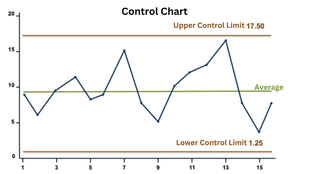
Control charts are visual depictions of quantitative data. In plain English, these charts show relationships between the numbers you’ve collected. This is a sample of a Control Chart:
The numbers can be from anything: How many minutes late or early is the school bus? How many apple pies are sold? How many customers gave us 5 stars on Google? Our stock price, the number of visitors to the museum, how many downloads of our app…you get the idea. They are put on the chart (plotted) along the left side, or y-axis.
The key is that the data are plotted over time.
How many apple pies were sold per hour? How early or late was the school bus each day? How many 5-star ratings did we get per month?
The time period (on the bottom or x-axis) can be anything: minutes, days, months, etc. The time period must be long enough (including enough data points) to show the relationship between the numbers. A rule of thumb is to have 12-20 data points before taking action, but that can vary depending on the process under examination. For example, if you’re looking at yearly numbers, you don’t want to wait 12 years before analyzing the data.
Control charts are called that because they have control limits. Control limits are created by the math done on the data, as derived by Walter Shewhart in the 1920s. For the math-curious among you: upper and lower control limits are defined as 3 standard deviations from the average.
For people like me: gather the data into a spreadsheet and ask a statistician (or software) to do the math and generate the control chart for you. (There are different types of control charts for different situations. Ask your statistician for details.)
Why Should I Care?
“Data are not taken for museum purposes; they are taken as a basis for doing something. If nothing is to be done with the data, then there is no use in collecting any. The ultimate purpose of taking data is to provide a basis for action or a recommendation for action. The step intermediate between the collection of data and the action is prediction.”
Dr. Deming, from: On a Classification of the Problems of Statistical Inference, June 1942, Journal of the American Statistical Association page 173 (article runs from page 173 to 185).
The control chart is the voice of the process. Looking at data in a control chart tells you if your process – whatever you’re doing that generates the data – is stable or not. It will also tell you about the variation your process produces.
Your control chart will tell you quickly if you can predict the results from your process into the future. In a stable state, the results will likely fall into the same range as the data you’ve already collected. In other words – unless you change something in the process, you’ll continue to get the results you see now.
Control charts let you become a true “Madam Cleo, Seer of the Future!”
Of course, control charts can also show that your process is not stable. If most, or even some, of your data are outside the control limits, you cannot predict what that process will produce next – and your career as Madam Cleo is over.
In practice, if your control chart shows an unstable state, you need to change something about the process to become stable. Only then can you start working on improvement.
For example, if your control chart shows your apple pie sales are not stable, then you know your process for baking or selling them is problematic. Maybe your customers are constantly changing their orders, or the ingredients aren’t delivered regularly. The voice of the process is saying: something’s wrong! Go check it out!
Make Better Decisions
No more relying on prior experience (which may or may not apply) or “gut reactions” to make decisions. No more random trial-and-error. No more running around putting out fires generated by chaos in your processes. After all, as Dr. Deming said, “Stamping out fires is a lot of fun, but it is only putting things back the way they were.”
You might not like what the data tells you about your stable process. For example, suppose the control chart shows that your organization pays bills 65-90 days after receiving them. In that case, you probably want to review your payment process, so your suppliers don’t send you to collections or desert you entirely.
Once your process is producing predictable results, you can start working to improve the process, usually by finding ways to reduce variation.
Anomalies in the Data
What if your control chart shows a stable process except for a few points outside the control limits? Those points are signals. Points where something about your process differed on that day (or minute, or year). Sometimes it’s worth investigating, sometimes not. Maybe you know right away: there was a power outage that day, so we couldn’t answer calls. It happens rarely and is outside your control, so you can ignore that signal. On the other hand, maybe tracking down a signal means you find someone who needs a little more coaching.
Note: other anomalies in control charts can be signals, such as 8 points in a row trending down. Talk to your statistician or rely on the software you use to report these signals.
Getting Started Without a Statistician
Not convinced? Start with simple run charts. A run chart is where you plot the data over time, as in the chart below. No math was involved in the making of this chart.
Simple Run Chart (not a Control Chart)
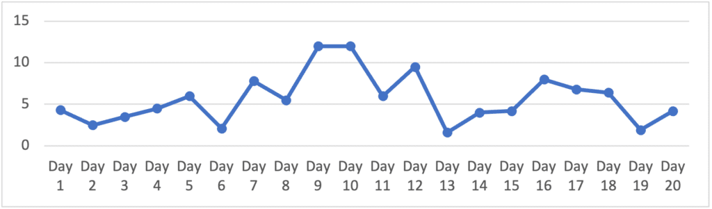
While you won’t have the precision of a control chart, a run chart will allow you to see the relationships between the numbers much better than a spreadsheet. If it looks like a crazy Jackson Pollock-style splatter of points, your process probably isn’t stable (though it could be, with a vast range of variation!) Run charts can help you decide what process to work on.
Your Secret Advantage
True story: a doctor’s office takes payment from patients as they leave. Patients often leave without paying because the person at the front desk is busy, and the patient forgets. Each month the finance manager mails invoices to the patients with the amount owed and an address for the patient to mail their checks. Once a patient is 2 months overdue, they receive a phone call. After that, another letter. The patient might even be seen again before paying for the first visit.
The doctor is likely saying, “Our cash flow is terrible!” Non-Deming leaders might decide the finance manager isn’t doing their job and pressure them to “do better” or, worse, fire them. Will that improve the cash flow problem? Of course not!
Deming leaders have the secret advantage of control charts.
The control chart shows that for this doctor’s office late payments are predictable (the process is stable). They can start asking about the processes: what factors influence cash flow? What is our process for invoicing patients? How easy is it for them to pay? They might start asking patients why they don’t pay on time.
Then the critical question: how can we improve our process to encourage more on-time payments? Or, in control chart language, how can we shift our stable-state data on the control chart to a different (better) stable state with less variation?
No blame. No rolling heads, drooping morale, or losing talent. Just working together to improve a process. (Dr. Deming gave us the Plan-Do-Study-Act tool to help devise and test improvements quickly and without committing significant resources to one strategy that may or may not fail.)
If you claim to be a “data-driven” organization but are not using control charts, then what data is driving you? Dr. Deming said: “Management by results — like driving a car by looking in the rearview mirror.” Wouldn’t you rather be Madam Cleo?
In the System of Profound Knowledge (SoPK), control charts are part of Understanding Variation. As with all aspects of SoPK, using control charts in isolation may lead you to wrong conclusions and “doing the wrong things righter.” If you want to learn more about SoPK and Control Charts, check out DemingNEXT – the only comprehensive online way to learn the Deming philosophy.
Related content:
India Fights COVID-19 with Control Charts https://deming.org/india-fights-covid-19-with-control-charts/
Using Control Charts to Aid in Improving the Classroom Learning Environment https://deming.org/using-control-charts-to-aid-in-improving-the-classroom-learning-environment/
But it Doesn’t Mean anything https://deming.org/but-it-doesnt-mean-anything/
Learning with the Science of Improvement during COVID-19 with Rocco Perla and Lloyd Provost https://deming.org/learning-with-the-science-of-improvement-during-covid-19-with-rocco-perla-and-lloyd-provost/
Knowledge About Variation: In this segment of Ian Bradbury’s talk at the 2013 W. Edwards Deming Institute conference, he discusses variation and using the control chart to aid improvement efforts. https://deming.org/knowledge-about-variation/
Using Data to Seek Continual Improvement, Not Just Process Behavior (Monitoring): A technical look at the math involved in building a control chart. https://deming.org/using-data-to-seek-continual-improvement-not-just-process-monitoring/
Applying Understanding of Variation to Large Datasets https://deming.org/applying-understanding-of-variation-to-large-datasets/
I discovered Deming years and years ago. I was drawn to it like a bear to honey. I discovered the hard way, just as Gene Woolsey says, people will live with a problem they cannot solve before they accept a solution they don’t understand.
No management at any company I worked it took the slightest interest, even ft I put it right in front of them. E.g., returns are running at ~10% a month consistently. This is causing chaos on the production floor. Here’s the chart. Answer: We believe we are making progress in that area. Me, to myself, Where’s the evidence of that? There was no change. The real answer was: We don’t know what to do. Don’t embarrass us. If I had to do it over again I would spend far more time finding allies and the right problem to start with.