

Guest Post by Dr. Doug Stilwell, Drake University
In my last paper, I wrote of a 1994 exchange between myself and my then supervisor, Dr. Doug Buchanan, in which during my evaluation at the end of my first year of being a principal, I shared I wanted to “change the educational world.” He paused and insightfully and correctly said to me I “needed to know something first” in order to have anything of value to share with anyone. While I believe Dr. Buchanan was telling me I needed “profound knowledge,” the notion of “knowing something” also suggests having some degree of knowledge about, in my case, the world of education, specifically the school I was leading at that time. Knowing things – possessing knowledge – helps one to begin the process of inquiry and improvement.
But what type of knowledge must one possess in order to make improvements, say, in student learning? The universal mantra of being “data-driven” can lead one to believe that if we simply accumulate data, we will somehow divine what to do next. But data or information according to Dr. W. Edwards Deming, is not the same as knowledge; something he tells us for which there is no substitute. Quantitative data, the type we typically collect and analyze in education, is simply a set of numbers/values – results of some sort of assessment – and means, on its own, absolutely nothing. The reader may disagree, but let me make my case for this by making a connection from a scene from the classic musical, The Sound of Music.
If you have seen the movie, or the play, you will recall the scene where Maria was attempting to teach the seven von Trapp children to sing; something that had been missing from their home since the death of their mother. During the “Do-Re-Mi” sequence Maria sang a series of notes, “do, so, la, fa, mi, do, re,” based on a musical theory known as “solfege,” in which every note in the major scale has a certain unique syllable (do-re-mi-fa-so-la-ti-do), and asked the children to repeat what she had sung. Maria continued to build on the complexity of her sequence, which the children, of course, repeated beautifully. It was at the height of this complexity of seemingly disconnected notes that the youngest of the von Trapp children, Gretl, tugs at Maria’s skirt and bravely announces, “But it doesn’t mean anything;” and she was correct. What the children were singing appeared to be random notes (data) that lacked meaning. . . until Maria emphasized this was a melody made up of the notes and then added the lyrics, “When you know the notes to sing, you can sing most anything.” In other words, Maria provided a context through which to understand and make meaning of the data (notes).
Educators are asked – no; directed – to be “data-driven,” and I have come to believe that this mantra may be the wrong approach to advocate, for while it is well-intended, without a deeper understanding and appreciation for making meaning of data, it may result in “doing the wrong things ‘righter’” (see previous article with the same title). We might look at the data, sometimes just one or two data points, believe we understand what it means (which may be a dangerous assumption) and then take action to improve the data. This observation is not a criticism of educators, but of the educational system; one that is too heavily driven by numbers without context and meaning, and one that may not prepare educators to be “meaning-makers” of data. As an example of the latter, in graduate school there is typically some requisite course in “educational research” and through the experience, educators learn how to manipulate statistical data using descriptive and inferential statistics employing statistical tools and processes that support their formal research. And while these tools and methods have value in undertaking academic research, there is a question as to whether they prepare educators in the field – on the front lines – to make sense of student data.
So, “by what method” might we pragmatically develop knowledge and make meaning that leads to action and improvement when confronted with student data that we collect? Let me offer two examples. One method comes from category seven (Results) of the Baldrige Performance Excellence Framework, communicated in the form of an acronym – LeTCI (pronounced “letsee” – emphasis on “lets”). The “LeTCI” framework focuses on the following:
- Le – current levels of performance
- T – Performance trends over time. In Baldrige, a minimum of three consecutive data points, at minimum, in any direction is required to be considered a trend.
- C – Making Comparisons with like students or groups
- I – Integration, to determine to what degree our results measure what matters.
Through the LeTCI method, educators determine at what level a student, or group of students, are performing. They would then look at multiple data points to determine if any trends, positive or negative, are present. Then, they compare the data with “like” students or groups, being careful not to use the data to rank, sort, or judge students, but rather, as Dr. Deming reminds us, to use results to help us coach and improve others’ performance. And, finally, determine if what is being measured is actually what is important to the school district and its customers – parents and the community. Through this examination and “meaning making” of the data, we can better understand what the data means in order to develop, implement, and monitor effective improvement plans.
Another method to assist in bringing meaning to data is through Walter Shewhart’s control chart and understanding the concept of variation. In a control chart, data plotted and calculated over time returns three important results: the mean score of the data set, the upper control limit (three standard deviations above the mean) and the lower control limit (three standard deviations below the mean). When results lie within the upper and lower control limits, the data, or system, is said to be stable. When the data/system is stable, it tells us that the results/data are caused by the system. When data lies outside the upper or lower control limits, there is something outside the system – something special – that has caused those results. As an example, if student tardy data were entered into a control chart and one student’s tardies exceeded the upper control limit, it would be necessary to investigate the reason the student was so often late. The investigation might uncover the fact that the student’s parent works the “overnight shift” and has difficulty getting up in the morning, causing the student to come late to school. Understanding whether results are caused by the system (common cause) or something unique (special cause) then leads to either focus on improving the system or giving special attention to a special cause. Without understanding what is causing the results (the system or a special cause), we may incorrectly attempt to either intervene our way out of a systemic issue or change the entire system for one unique situation. Either way, our efforts toward improvement will likely fail.
Let me provide an example of a control chart and how it might be interpreted. Below are 13 years’ worth of annual reading data results from different years of students at the same grade level in a school district in Iowa. Note that the mean score is approximately 292 while the lower control limit is approximately 281 and the upper control limit is 304.
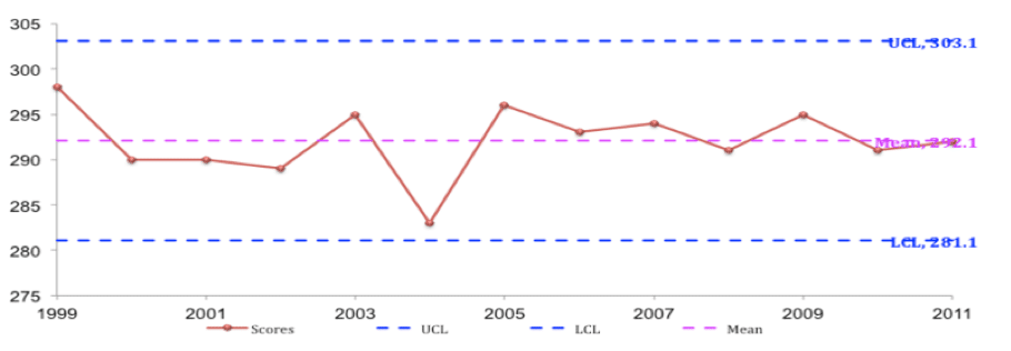
First, notice that all data points fall between the upper and lower control limits, which means the system is stable. Without understanding variation while interpreting the data, focusing solely on the results from 2004 might provoke the following inquiry: “What happened in 2004 and what was done to correct course?” An understanding of variation tells us that while 2004 had the lowest result, it was still within the upper and lower control limits; meaning there was nothing particularly “special” about this group of students and their results. In truth, no corrective actions were taken in response to the 2004 results, for what we see in this control chart is “normal variation,” caused by the system. To have the system respond to a single data point, such as 2004, by changing the entire system – particularly since it falls within the upper and lower control limits – would be known as “tampering” with the system and might do more harm than good. That said, because the 2004 group was close to being below the lower control limit, I would pay attention to the group as they moved through the system to ensure they were making adequate progress.
Keep in mind that having a stable system does not mean one must be satisfied with the results. In the control chart above, there should be two goals over time:
- Raise the mean
- Reduce the amount of variation between results (aka reduce standard deviation)
The theory behind the control chart relates directly to what educators know as MTSS (Multi-tiered Systems of Support), which is based on the theory that:
- 80% of students (Tier 1) will have their instructional needs met, will be met through whole-class “universal instruction”
- 10-15% of students (Tier 2) will require small group interventions and
- 5-10% of students (Tier 3) will need intensive, individualized support
In other words, the vast majority of student needs will be met by the “system” (Tier 1). Some will require a bit more support (Tier 2), and a very small percentage will receive more than the system provides in tiers one and two. To make the control chart connection, students in Tiers 1 and 2 will have their needs met by what typically happens in the system, while Tier 3 students would be characterized as “special cause” requiring special supports that go beyond what the systems offers to everyone.
Control charts also help us to highlight the misunderstood and misapplied concept of “average” and that of being above or below average. Notice two things about the data in the control chart in this light:
- Not one data point lies exactly at the mean. This supports the thesis of the book The End of Average in which author Todd Rose (2016) explains in greater detail that “average” is a mythical concept; an arithmetic calculation that leads to what he refers to as “averagarian” thinking, which espouses that we can understand individuals by looking at averages. In other words, “The mathematical concept of averages has its purposes, but it’s irrelevant when applied to human nature.” (https://lifeclub.org/books/the-end-of-average-todd-rose-review-summary).
- The reality is that some student and/or group results will be above and some will be below average, a fact that makes sense. . . once you think about it. When data from which the mean is derived are plotted relative to the mean, arithmetically approximately half of the results should be above average and half below. In the example above, six data points out of 13 fall “below average.” What does it mean? – certainly not as much as we make of it, for if the entire population of the world was given the same assessment on any given day, approximately half of the world would score “below average.” However it can be devastating for parents to hear their children are labeled “below average.” The reality here is that the only place where “all children are above average” is in Garrison Keillor’s mythical town of Lake Wobegon.
So what can we do to make better sense of data to help guide our decisions as educators? Here are some simple questions that may guide meaning-making of data:
- Have we collected the “right” data? In other words, are we actually measuring and collecting data based on what we value and wish to improve?
- Have we collected ample data? During my own tenure as a school principal, I can attest to the practice of developing annual building goals around student achievement by typically looking at the results of the most recent set of standardized tests, a practice in which I know I was not alone.
- Do we have an assortment of data that helps to paint a more complete picture of performance? One data source tells only part of the picture.
- Is the system stable or unstable and how volatile is the variation? If the system is unstable, a leader’s first job is to make it stable.
- Can we determine root cause from the data? The data are merely symptoms. Simply examining scores and results does not tell us what caused the results. Determining root cause of the results will direct improvement efforts at fundamental causes rather than symptoms. Lower-than-desired results is not the problem; they are a symptom of a problem. It’s like understanding that a high pulse rate taken on the wrist does not mean there is a problem with the wrist; it’s merely a symptom of something else, in this case, the heart.
Improving learning results, or any results for that matter, requires that that we know something first. The first thing we need to know is that despite a call to do otherwise, data should not drive decisions in schools. Dr. Deming would likely tell us that we need to go deeper than being “data driven.” Data is simply information, and Dr. Deming tells us that what we need is knowledge. At the most fundamental level we need to be able to answer the question, “What did the data help us to learn?” The answer to this question then helps us to develop and operationalize an improvement theory.
What education needs is two-fold:
- Adequate training for educators to make better sense and meaning out of data. This will lead to…
- Individuals who have the knowledge to understand what the data does and does not mean in order to inform decisions that are made regarding potential actions to be taken to improve student learning results.
Relative to these recommendations, I encourage educators to become familiar with Baldrige’s LeTCI and Shewhart’s control charts, for they can be key to developing the requisite knowledge to make wise decisions relative to improving student learning and will eliminate “knee-jerk” reactions to data that “doesn’t mean anything.”
To learn more about making meaning of educational data and the Drake Continual Improvement Network, contact Dr. Doug Stilwell at doug.stilwell@drake.edu.
References
Deming, W. (2018). The new economics for industry, government, education (3rd ed.). Cambridge, MA: MIT Center for Advanced Educational Services.
Rose, T. (2016). The end of average: How we succeed in a world that values sameness. New York: HarperCollins.
Rose, T. (n.d.). The end of average summary and review. Retrieved from https://lifeclub.org/books/the-end-of-average-todd-rose-review-summary.
Wise. R. (Producer and Director). (1965). The sound of music [Motion Picture]. United States: 20th Century Fox.
There is such truth in the statement of the commonly held belief that ‘data-driven’ is how we should all strive to be. Dr. Stilwell makes a great point, which is ‘What story does the data tell?” Furthermore, what are we trying to know and understand when using data? I appreciate the reminder on common cause variation and special cause variation as it relates to jumping to conclusions and perhaps treating symptoms and not the disease or changing everything for what was only a special cause variation. The word ‘tamper’ is a strong word to use when classroom and school leaders want to do things to help and improve, but this is evident unless meaning is made from data. I had not thought about a control chart as it related to Multi-tiered Systems of Support.
Percentile rankings, PLC “data dives,” “what’s the data tell us,” amongst many others are common within my building, however, we never get to answer the question, “what did the data tell us?” As educators and leaders we must acquire the necessary tools to make informed decisions, such as, a control chart. We must know if our system or something outside the system is causing the results, in order to correctly intervene and not just have a “knee jerk” reaction.
I really enjoyed reading this article. I agree with it so much! It made me think of the school that I am in and how we look at data, especially within the DOP (Drop Out Prevention-At Risk students) area, which is more or less our Tier 2 level of support for students. My DOP PLC meets the third Wednesday of every month to discuss students that would qualify to be classified as DOP. This decision is made by looking at our matrix, which has four indicators (attendance, connectivity, progression, ISASP). If a student meets just one of these indicators they automatically get the label of DOP and supports of some sort are put in place. As a student gets more indicators the more supports are put in place. Once a student is labeled DOP they get flagged in our system, so that all the students teachers will see. Typically, when the teachers in my building see a flag indicating DOP it makes the teachers nervous because they automatically label this student as a problem student, which isn’t always true. Teachers have the misconception of what these flags mean, and when they see the flags, they find the SPED teacher or the DOP teacher to handle those particular students, instead of treating them as a general education student first. This is one of the biggest reasons as to why I feel that knowing what the data means, how to interpret the data, and even communicating to others is so important.
I’m a math teacher and am ashamed to say I have never thought about average in the way you described. I am actually ashamed of myself for sharing percentile ranks to parents on standardized test at parent teacher conferences. What good was I doing telling a family, their child scored in the 45th percentile or your child preformed in the 75th percentile. I was focusing more on performance more than growth. As a parent of a child who has some developmental delays, I can’ t stand going to the doctors or therapy and having to fill out paper work on what my child can and can’t do. I know my child is in the first percentile I know he is behind. As a parent I have to constantly remind myself about the daily growth and progress my child is making. I can’t help but relate my child and his progress to a control chart. I wonder if all of the data from “normal” kids and him if plotted on a control chart would show if my child was a special cause of if the system was stable.
I agree that Data without proper application is useless. The continued reflection in my current work with curriculum constantly reinforces Dr. Deming’s question “By what method.” The method that the administration and instructors utilize data does not reflect the wanted outcome for students. To further increase student growth and achievement the data from assessments, culture, and instruction must be utilized with the correct method. However, the utilization of too much data drowns any use of it within the system resulting in no systemic change. A vision and purpose must be established to use date to best assist all be successful.
I enjoyed reading this article. I agree with so many points you made. As I was reading, I was mentally going through the different ways we “collect data” as 2nd grade teachers. Throughout the school year, we use different tools and techniques to measure student learning (collect data). We have a school wide data sheet, that builds as students progress through the grades. This is a start to collecting that “over time” data when considering students for the different Tiers of MTSS. We use a system called Panorama to monitor our Tier 2 and 3 students. It collects, summarizes, tracks goals, and monitors student growth through different entries of testing. We look at this every 8 weeks to see how students are responding to the intervention they’re receiving. In terms of being sure we’re using the data we collect wisely, I feel as though we made a step in the right direction towards this last year. After each unit of our phonics program, we administer a post test. This post test examines how students are able to spell words correctly using the specific skills we are working on. We sat down and stated that the goal of phonics is that students are able to improve their word solving skills in reading, and improve their spelling in writing. We realized that if students are spelling the words correctly in the assessment, but aren’t able to spell it correctly during writing workshop in their writing pieces, the good score on the phonics assessment “doesn’t mean anything”, because they aren’t able to apply the skills to writing. We now use their writing pieces to help inform the scoring of their phonics assessments, and think of ways to support students with phonics during writing. More work like this needs to be done in terms of other assessments in our classrooms.
Thank you for this post, Dr. Stilwell. I agree with so much of what you wrote. I was making connections to my work in using data to inform IEP teams in determining what individual goals to write for students for the upcoming year. These high-stakes decisions will determine what specially designed instruction will occur. The data also informs teams about how much students are in the least restrictive environment throughout the day. Often, when students may exhibit behaviors that are concerning, teams are VERY anxious to make decisions to change huge parts of the IEP, when we are looking only at a short amount of time, or data instead of looking at the data and the context of the data to help us have an informed conversation about what the data means. Teaching teams how to look at data to inform decisions is a very important skill that needs to be addressed in many school systems.
A lot of these “knee jerk” reactions come from a looking at a piece of the data. The control chart and the LetCI model of analyzing data helps review the information and see what it means. Since there are so many stakeholders in education, people expect results now. The average person wants to see the quick fix, even if it is not the right thing for the system. Many people want to fix the symptom of the system, which is not beneficial to that 80% of which a system can fix.
Many educators are never taught how to analyze data. This would be a good place to start in order to make informed decisions based on data. Collecting data just for colleting data’s sake is not effective if there is no way to look at it. By teaching young educators how to look at data and use it effectively we can help all students and create better truly “data driven” systems.
Data is everywhere and as educators and leaders we look at data both quantitative and qualitative. I don’t know how many data driven meetings I have been in where we just “look” at the data. You stated, “Quantitative data, the type we typically collect and analyze in education, is simply a set of numbers/values – results of some sort of assessment – and means, on its own, absolutely nothing.” I could not agree more. I think of myself as that systems thinker, but in order to be able to make change the questions being asked from what the data says are what is going to bring the change and meaning. School systems need show importance of with the questions “BUT WHY?” “BY WHAT MEANS/MEASURE?” and create actions based upon the answers to the questions.
I’m a high school math teacher and have been teaching AP Statistics for many years and I constantly see people in all walks of life interpreting data incorrectly. I agree that educators need to learn how to manipulate and interpret data better, but I would argue against giving them things like LeTCI. In my opinion, giving them this tool will give them just enough knowledge to be dangerous. There’s nothing worse then someone thinking they know the correct answer when they really don’t have any understanding of what’s really going on. Quoting Destin Sandlin, “Knowledge isn’t understanding.” Instead, we either need educators to learn how to manipulate and interpret data or only have people that do know how to do it.
Another thing I think is missing is how data is used in education on a day to day basis and in determining grades. From my vantage point, the push to collect hard data has gone too far in that soft data e.g. teachers’ observations, intuitions and experience, have apparently become obsolete which has only contributed to the eroding of the professionalism of teachers. It’s now required for teachers to prove to everyone they know what they’re talking about. To have data to prove that a student has or has not learned something. Also, the idea that we need to pretest everything all the time even though we know from years of experience our students will not know or will struggle with something. I completely agree with the notion that data has the ability to show you something you didn’t expect to see, but that can only happen if you understand how to manipulate and read the data and to not only look for what you believe to be true (confirmation bias).
Finally, I agree with the trouble of the use of averages. They have their place, but when it comes to comparing children, I don’t think it belongs simply for the fact that half are above and half are below. I also see the average being the only thing used in determining grades. I firmly believe the average’s only potential place in determining grades should be as the starting point and not the end all be all. But this requires the idea of being data informed and not data driven along with the return of professionalism to the teaching profession.
Great article, but your response is spot-on. I am a data chair for my school. I have advocated to leadership who may have power to effect change that we need to move away from data-driven instruction to evidence-based instruction. The amount of time devoted to collecting and discussing meaningless data is infuriating. Your caution of danger with providing people with enough knowledge to make them feel like they know something is powerful.