
On March 24, the Prime Minister of India announced a nationwide lockdown to slow the spread of the novel coronavirus COVID-19. In a country a third the size of the United Sates with triple its population, the potential for catastrophic outcomes is extremely high.
As the infection rates and death tolls mounted, Balaji Reddie, founder of The Deming Forum India and a member of our Advisory Council, noticed something odd. The media was simply reporting the rising numbers of cases and deaths, contributing to a general sense of rising panic. But little attention was being paid to how those numbers related to the rate of testing or the rate of recovery from the illness. Were things really getting worse, despite the extreme measures being taken?
A Dose of Deming
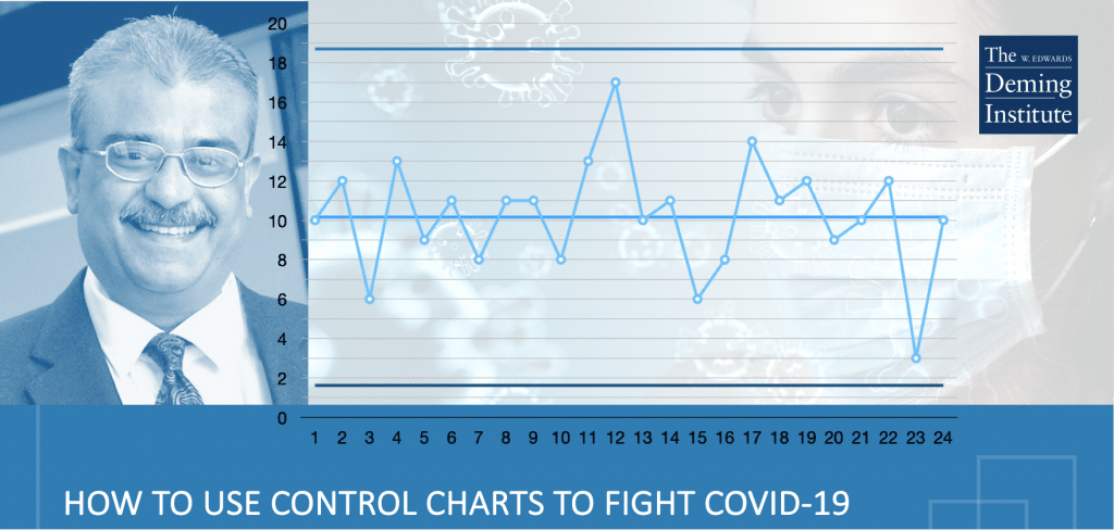
Balaji realized that what the public needed right now was a big dose of Deming – starting with control charts. “Everyone went into overdrive on statistical modeling to assess the effectiveness of the lockdown,” says Balaji. “Is it working? If so, how well? I saw that no one used control charts there. I decided to use them based on my experience.” Drawing from data shared by the Indian Council for Medical Research, Balaji proceeded to compute the ratios of positive cases per day to the number of tests conducted; recoveries to the number of cases daily; and fatalities to the number of cases daily. “I drew control charts for these ratios. For positive cases, if the ratios were fluctuating within limits, we could say that the system is stable – but the additional information I had was the control limits. The upper control limit would help me brace for the highest number of cases possible. Can I control that? No. Can I predict it? Yes.”
Control Charts Show: The Lockdown is Working
What Balaji discovered is that the lockdown was indeed working – not the conclusion you would come to if all you looked at were the rising numbers of infections and deaths. “The trend in the ratio of the number of positive cases per day has been steadily decreasing. The trend in the number of recoveries per day has been steadily increasing. The trend in fatalities is something we need to be concerned about – it’s stable, but not decreasing. If I had looked at the data in a more ‘typical’ way, I’d be panicking unnecessarily. Without understanding the difference between Common Causes and Special Causes, I’d be reacting rather than responding.”
India’s Government Takes Notice
Balaji sent his graphs with their interpretations in the form of a report to Dr. Giridhar Gyani, Director General of the Association of Healthcare Professionals in India and a close associate of the person heading the COVID-19 Task Force reporting to the Prime Minister. The response was overwhelmingly positive, and they asked Balaji to send in regular updates of his analysis. While he is not privy to specifics about how his reports are being used to make decisions, there is no doubt in Balaji’s mind that they are shaping public policy in real time. “As Dr. Deming said, ‘management is prediction.’ If you can predict it, you can manage it. When I drew the charts, I could predict numbers on a day to day basis – sometimes with frightening accuracy.”
We Are In This Together
Balaji hopes that his work will inspire others to look at coronavirus data with control charts – and interpret that data through the Deming Lens. “Dr. Deming vehemently goaded everyone (industry, government, education, healthcare) to focus on cooperation amongst each other at an individual and global level. I believe the world is realizing that and coming together in a big way for the first time in years. I have, of course, always believed in his works – now I have proof and evidence to show the world that he was indeed right.”
What’s Next?
Free Webinar with Balaji Reddie!
Join us Thursday, May 14 for “Out of the Crisis: How Control Charts Can Help Us Fight COVID-19,” a free, live webinar with Balaji Reddie, hosted by The Deming Institute. He’ll walk you through the control charts on COVID-19 data that he is sharing with the Indian government. And he’ll help you understand how you can use control charts in your organization to inform your management strategy. Note: This webinar is limited to 100 participants – register now to reserve your spot!